Indiana University
2026
A conversational interface that helps international students understand U.S. health insurance, estimate costs, and know what to do next before a doctor's visit turns into a surprise bill.
Overview
Making U.S. healthcare insurance understandable for international students
International students arrive in the U.S. and are immediately expected to choose an insurance plan, decode terms like "deductible" and "coinsurance," and figure out whether a provider is covered at all without the context that domestic students take for granted. I served as the sole product designer on a three-person team investigating this problem, working alongside two UX researchers to turn primary research into
HealthConnect: a conversational tool that answers healthcare and insurance questions in plain language, tied to a student's actual plan.


The Impact
100%
Users experiencing reduced healthcare confusion
80%
Users reporting positive behavioral healthcare related knowledge understanding.
Across usability testing, every participant reported a clearer understanding of insurance terminology and cost concepts after using HealthConnect
Most described a shift in confidence: from uncertain about whether to seek care to willing to book an appointment.
The evaluation also surfaced a clear next step: users understood individual terms but not how those terms connect, which became the central design challenge for the next round of work.
Problem
Students had no single, trustworthy place to ask "will this be covered, and what will it cost?"
The U.S. model requires students to actively choose a plan, track spending against a deductible, and independently verify network coverage, all while adjusting to a new country.
Existing resources (orientation sessions, insurance portals, general search) each solve a narrow slice of this and leave the rest to the student, which is why delayed care and unexpected bills came up in nearly every interviews.
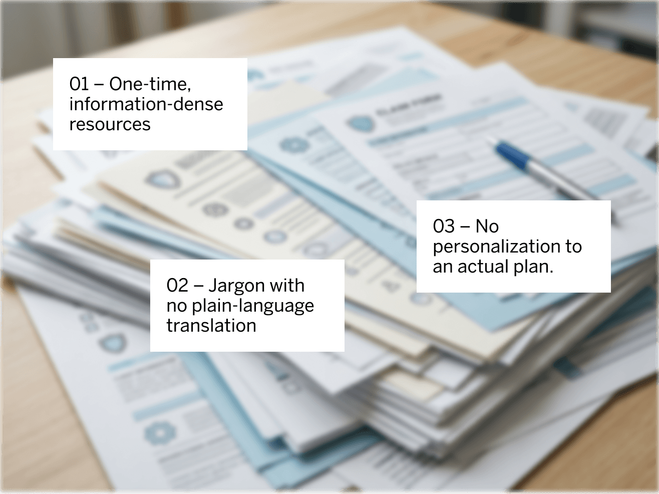
Initial assumptions
We started from the assumption that the core problem was a lack of information; students simply didn't have access to the right explanations.
Research complicated that quickly.
The gap wasn't access; it was the ability to interpret, apply, and trust the information that already existed. That reframing changed what we were designing: not a better encyclopedia, but a system that could apply a definition to a person's actual situation.
Research
Listening before designing anything
Identifying Research Goals

Primary Research - Interviewing international students through convenience and snowball sampling within the university's international student networks
We opened with a problem-space study built around three research goals:
10
International students holding U.S. health insurance, recruited across a range of countries of origin(India, China, South Korea, and Columbia). Participants ranged in age from 22 to 30 years old. Fields of study included Human-Computer Interaction, Computer Science, Data Science, Informatics, Health Informatics, and Business Administration.
45-60 minutes
Each interview covered prior insurance experience, current pain points, cost-estimation behavior, and openness to a conversational tool.
One thread ran through nearly every interview:
Students could look up a definition on their own; what they needed was to know what that definition meant for their situation.
Secondary Research - Literature Review of related work and existing literature on international-student health-insurance literacy
We treated the transcripts as raw material for thematic analysis: every direct quote, behavioral pattern, emotional response, and pain point became its own data point.
Combining that with, rather than relying on our sample alone.
We chalked out what emerged:
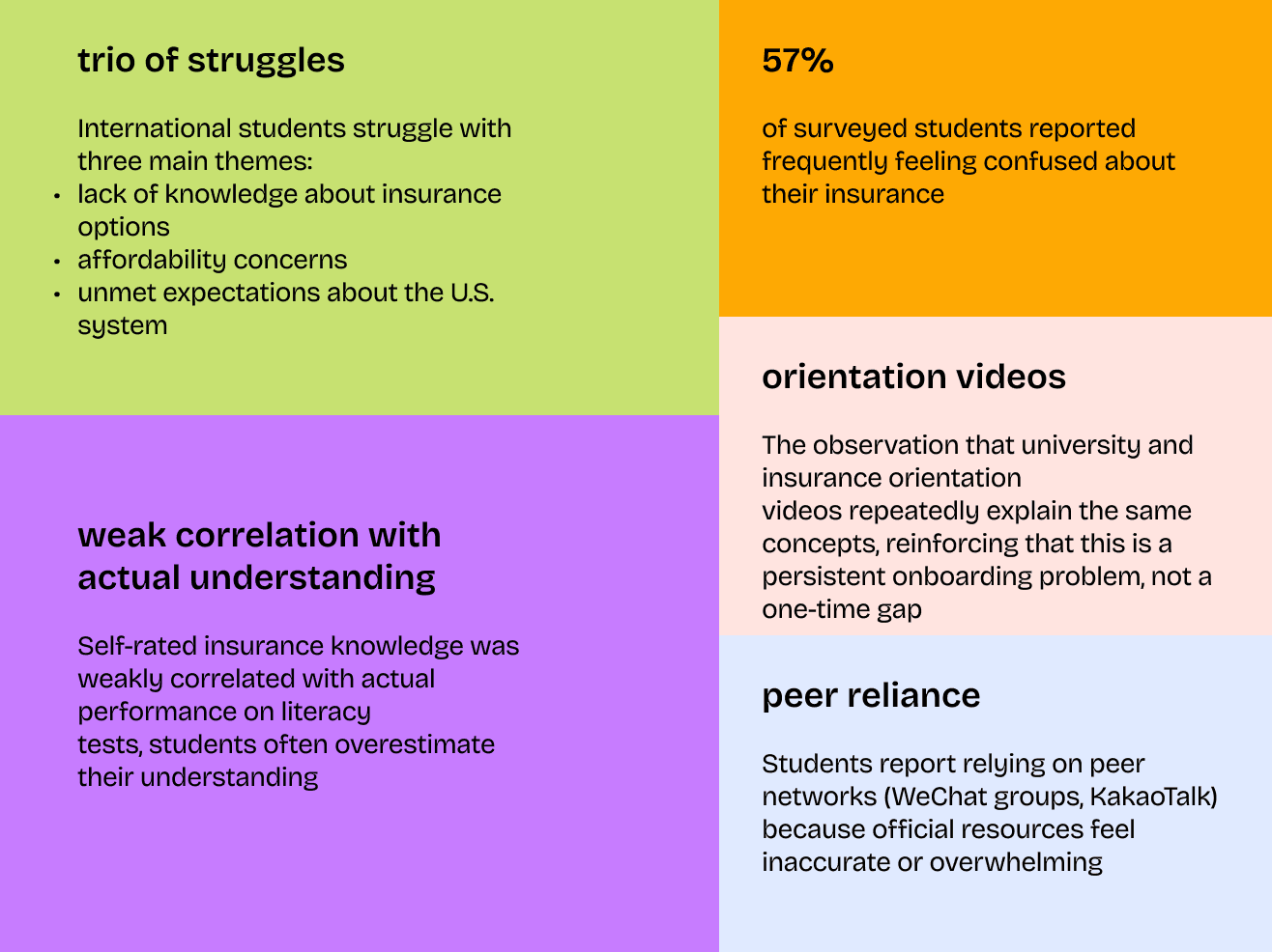
Emerging Pain Areas
We treated those findings as early-stage signal rather than validated evidence, which shaped how confidently we could recommend some of the design implications below.
Affinity mapping the transcripts surfaced five consistent patterns regardless of background:

Ideation
From five themes to three design pillars
I distilled the 5 research themes captured via affinity mapping into 3 key "How Might We" questions, a way of turning documented frustration into direction.
01
How Might We
Bridge the gap between a student’s home-country healthcare experience and the U.S. model through real-time, natural language education?
02
How Might We
Eliminate "billing anxiety" by providing upfront, plain-language cost estimates and real-time financial tracking?
03
How Might We
Transform healthcare logistics from an exhausting "part-time job" into a proactive, guided conversational experience?
Direction
Rather than one general-purpose chatbot, we committed early to two connected, persona and scenario-specific flows:

User Scenario:
Insurance card decoder - Wei uploads a photo of their card, CUI identifies and explains key fields (Member ID, Group Number), then proactively guides them to find an in-network Primary Care Physician

User Scenario:
Jargon translation - Mateo asks about "deductible," receives a plain-language analogy, then checks their personalized deductible status.
Design
Designing a system that explains, not just defines
Designing the conversation, not just the flow
Once I mapped the two flows, the harder design problem was making them sound right. Our research kept surfacing a "systemic shock" where students were overwhelmed by unfamiliar terms and a one-time orientation dump of information.
So instead of dictionary-style definitions, I wrote the dialog around home-country analogies: explaining a deductible, for instance, as working like a cover charge at a club; you pay that amount first, then the venue covers the rest.
The intent was a system that read less like a search engine and more like a knowledgeable peer translating an unfamiliar system in real time.
Flow 1
Flow 2
Guiding to the next step
Both flows close by pointing the student to a concrete action, like finding an in-network provider for an upcoming appointment rather than leaving them with information and nowhere to take it.
Usability Testing
Testing how was the comprehension achieved
Scenario-based user testing
The goal behind this usability evaluation was to test whether it worked, not just whether people could use it, but whether it changed how confident they felt making a real healthcare decision.
10
Participants. 5 internationa students, 5 proxy users recruited through personal and professional networks and split across two evaluators.
30 minutes
Each session's duration, in person or virtual.
Testing Structure
Each participant asked to "think aloud" through a structured scenario and no leading prompts beyond what the script allowed.
Constraint
Limited Access
Given that access to the primary target population was limited, we used scenario-based testing with an even mix of international students and proxy users to gather actionable feedback on core design elements and task flow.
What worked
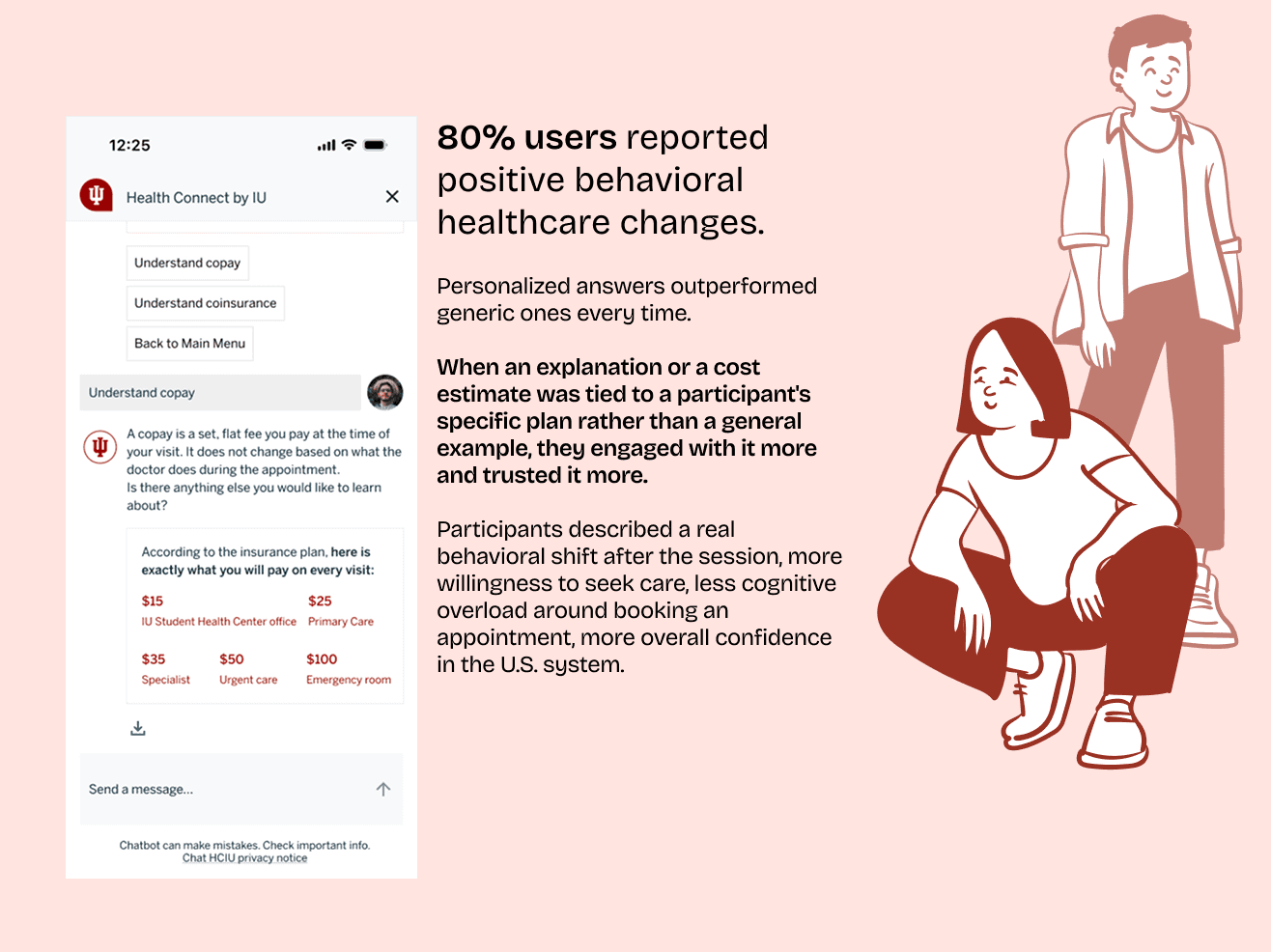
What did not work

“The $15 number genuinely surprised me. I have been in Indianapolis for a year and I avoided going to the doctor three separate times because I was scared of the cost.”
Interview participant
Grad Student @IU Indianapolis
A few smaller issues surfaced too:
60%
Participants started the session with low baseline confidence in U.S. insurance, reinforcing that the system needs to assume no prior knowledge rather than some.
Absence of Visual Grounding
An unlabeled download button left several participants unsure whether they could save their results, and more than one wanted clearer feedback when the system had actually completed an action.
Need for Multilingual Support
Absence of multilingual support came up as a real accessibility gap. It notable given who the product is built for.
Future Scope
From definition source to decision support system
Testing pointed to one clear shift for the next version: HealthConnect needs to stop functioning as a glossary and start functioning as an active decision-support system.
Analogies helped, where comparing a deductible to a "bucket" landed well, but real behavioral change only showed up when participants saw their own plan data applied to a real scenario.
Design opportunities

Cost interaction models → Human escalation → Multilingual support
Next steps
Three directions carry this into the next iteration:
Building "real cost" scenarios that preview the full financial lifecycle of a specific visit, from check-in to the final bill.
Adding a human escalation path so a complex billing dispute or a serious symptom can route to an actual insurance advisor or triage nurse rather than stall in the chat.
Expanding multilingual support across the core conversational flows, since English fluency isn't guaranteed for the population this is built for.